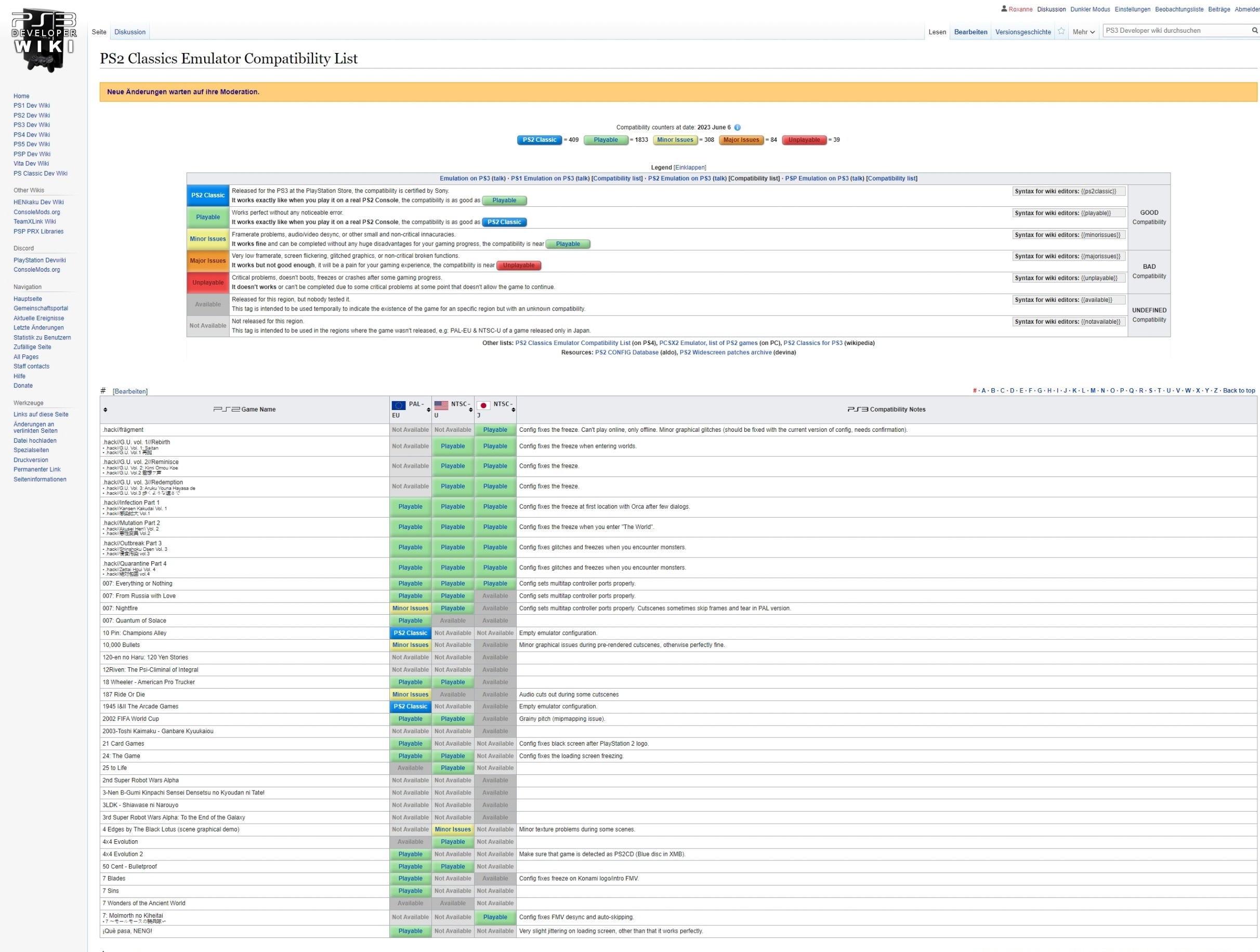
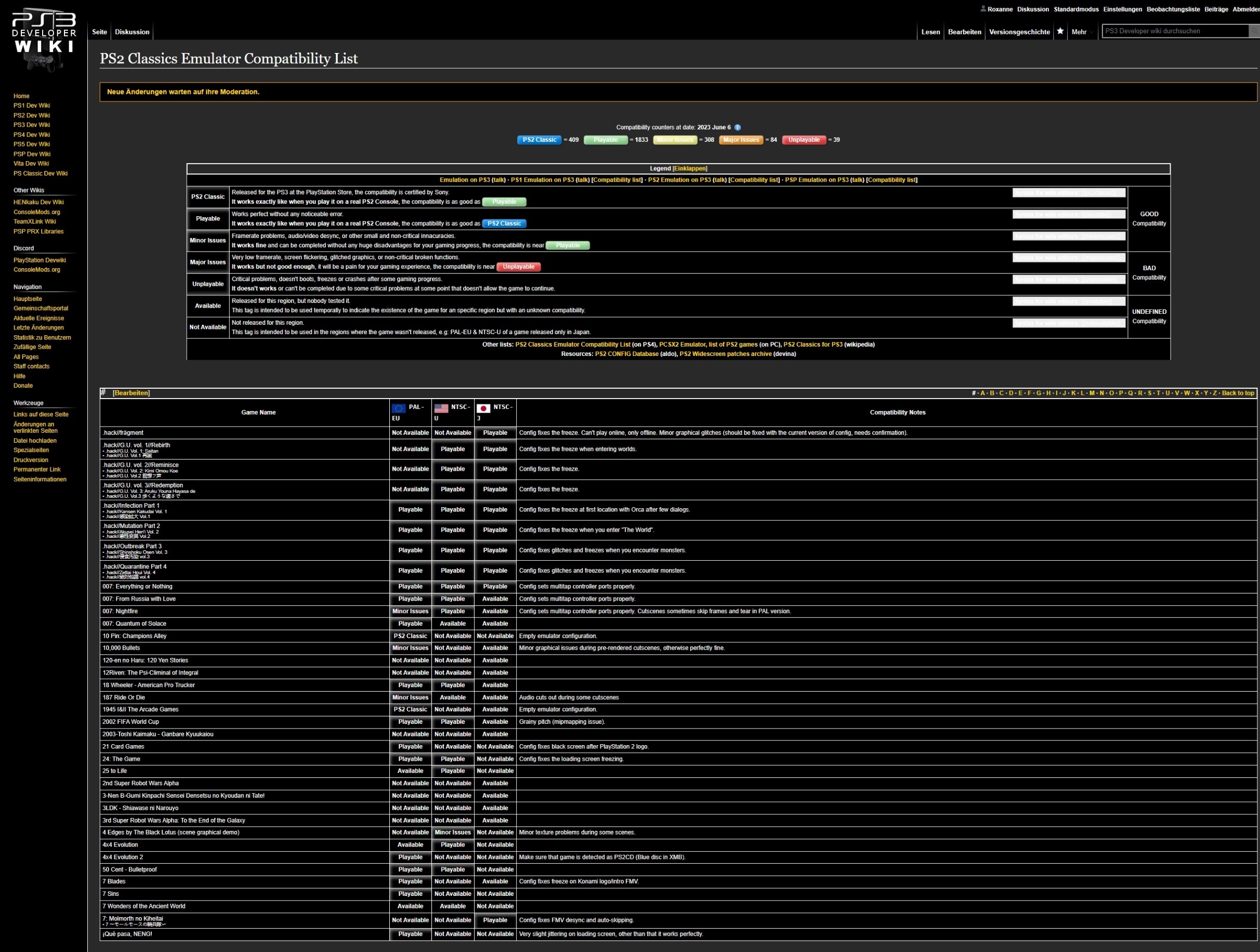
Dark Mode Suggestions
Puh ... where I start this?
Not only that this shouldn't be at all live in the current setup, the announcement on both Twitter and Discord was like we released a finished product. Instead as already explained on Discord that "we have now open Pandora's Box" in terms of editing either the CSS code or half of the wiki itself (or both). Before releasing a feature like this and bringing it live, we should make some specific rules (!) we need to discuss before (oops. agreed. ~Derf). But it seems that people got already excited with turning everything from White into Black without thinking about the consequences of the readability of the wikis itself.
- There's no way to fully test it all in isolation currently, but I could probably make a test environment down the road (beta.psdevwiki.com or something). A bit of a pain to setup, but it's also something I want to setup for testing MediaWiki 1.40 anyway. You gotta break a few eggs to make a dark mode omelet :) Derf (talk) 09:07, 11 June 2023 (CEST)
- My suggestion would be that instead of releasing it immediately within PS3 wiki, we should have to implement it on the smaller ones like PS1 wiki or PS Classic Wiki. Since they have only 20 articles at all, it would be easier to check what needs to be fixed and what needs to be improved. Then we could implement it to bigger ones like PS2, PSP, Vita or PS5 to find even more errors and to fix them, kinda like a learning curve. Instead we implemented it on the biggest of all wikis, which is bad.
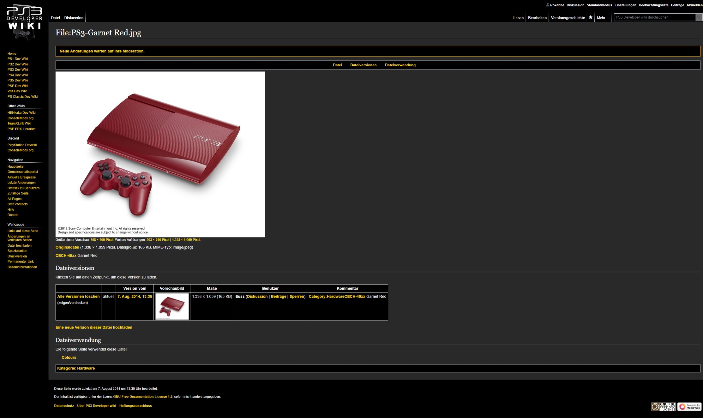
- We need to discuss what we will do with images uploaded as .jpg files having a white background.
- I think this is the one big trade-off. JPGs are JPGs, and I definitely don't want to edit them all into PNGs. Potentially it could be done in bulk if there's a tool out there to convert them to PNGs and detect and remove the white background - but perhaps it's best to just leave it as is. I don't think it's a big deal for any images outside of the Main Pages (which those I can fix by hand). Derf (talk) 07:43, 11 June 2023 (CEST)
- We need to discuss which colors needs to replaced in Dark Mode because there are now red links for non-available pages displaying just white together with many more bad examples.
- Same as with the problematic about the red links, every page containing XML code or Templates are now broken in Dark Mode because of displaying every text in white in front of a black background (it seems templates are working as long there aren't in any tablecells).
- Also I have the feeling that the font is now bigger in Dark Mode together that spaces are needing more space (a good example are when looking at the Main Page where every Template is now needing more space than in light mode.
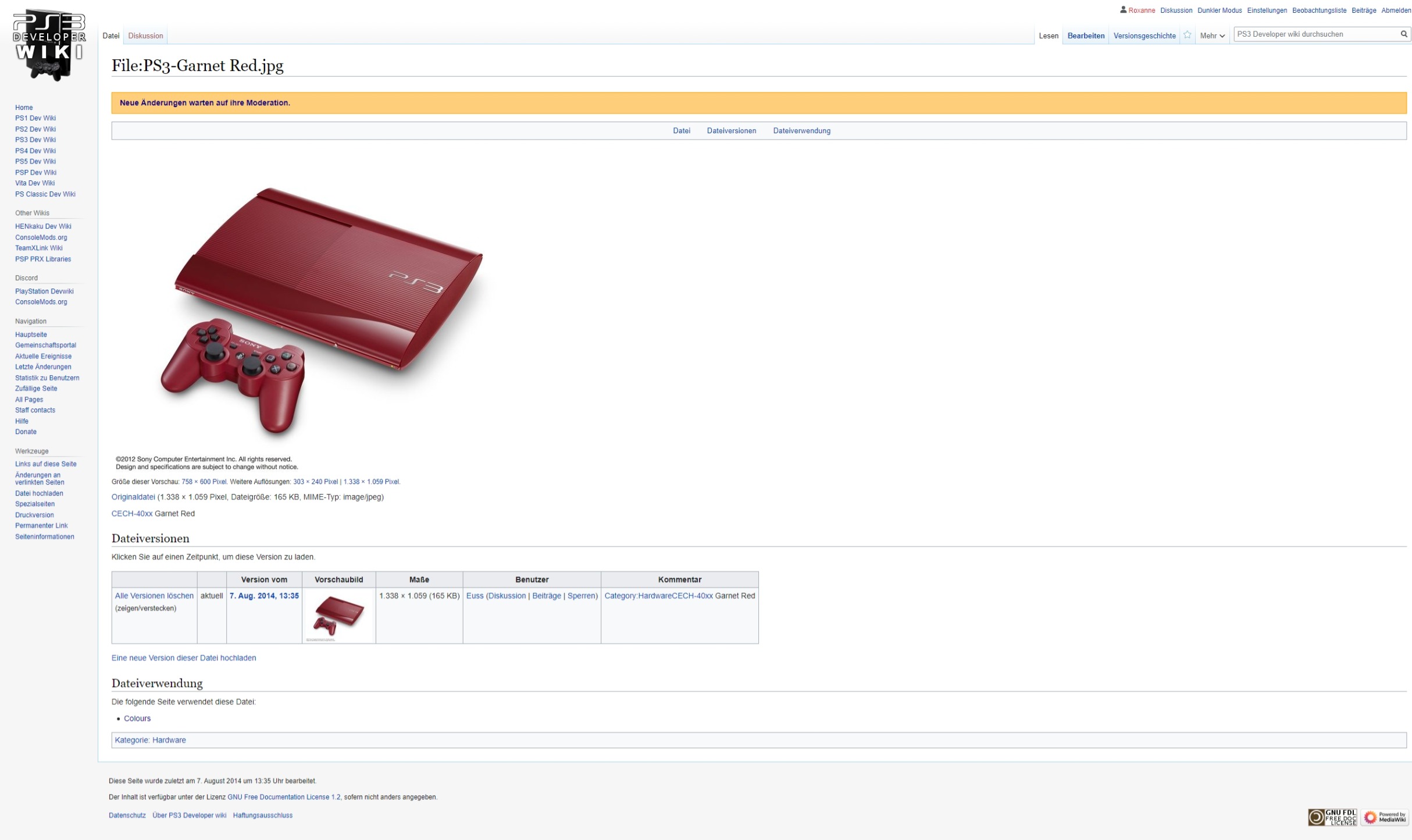
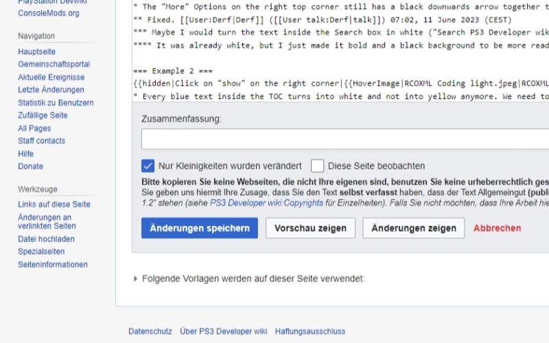
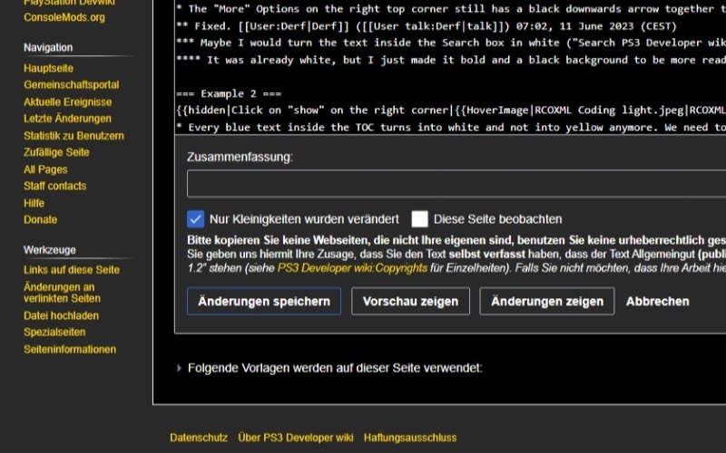
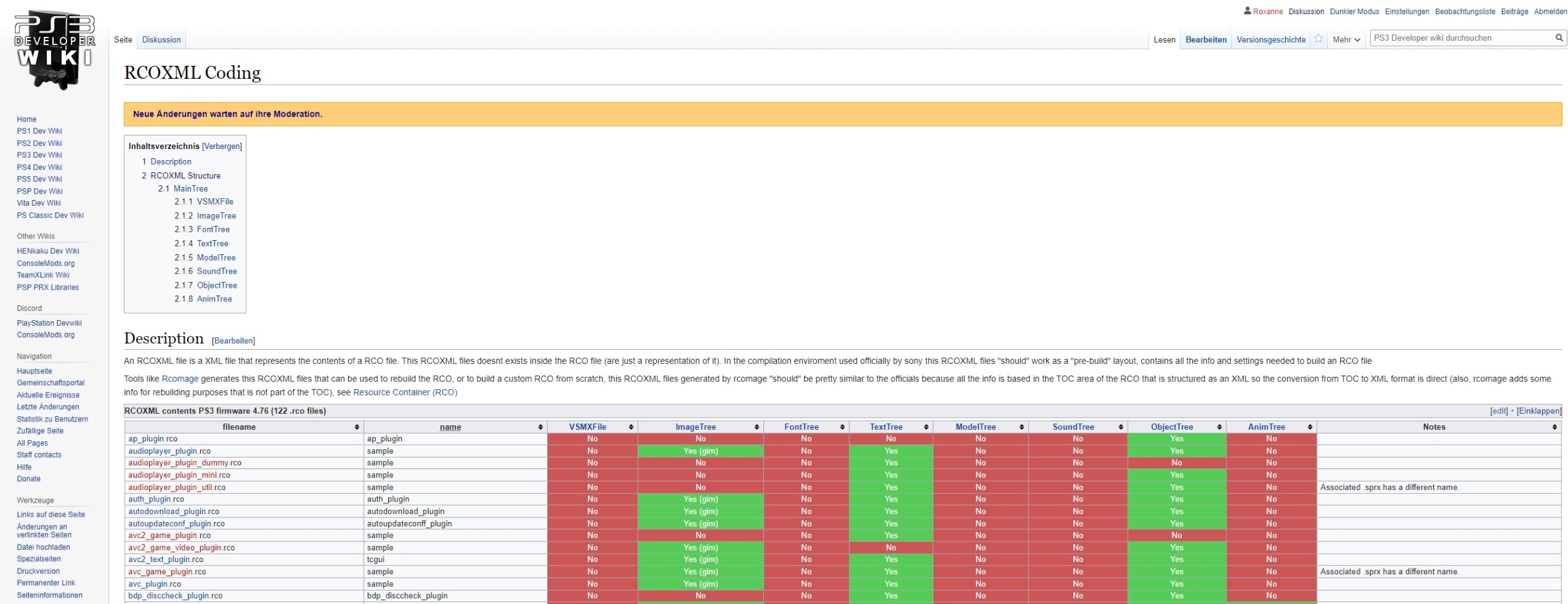
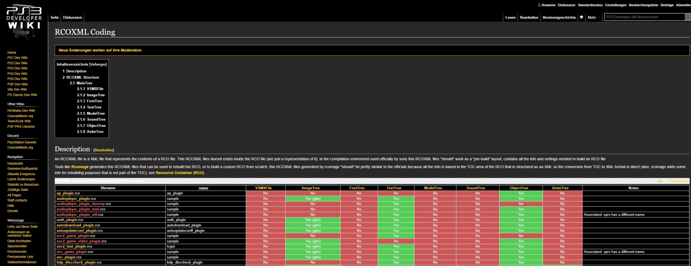
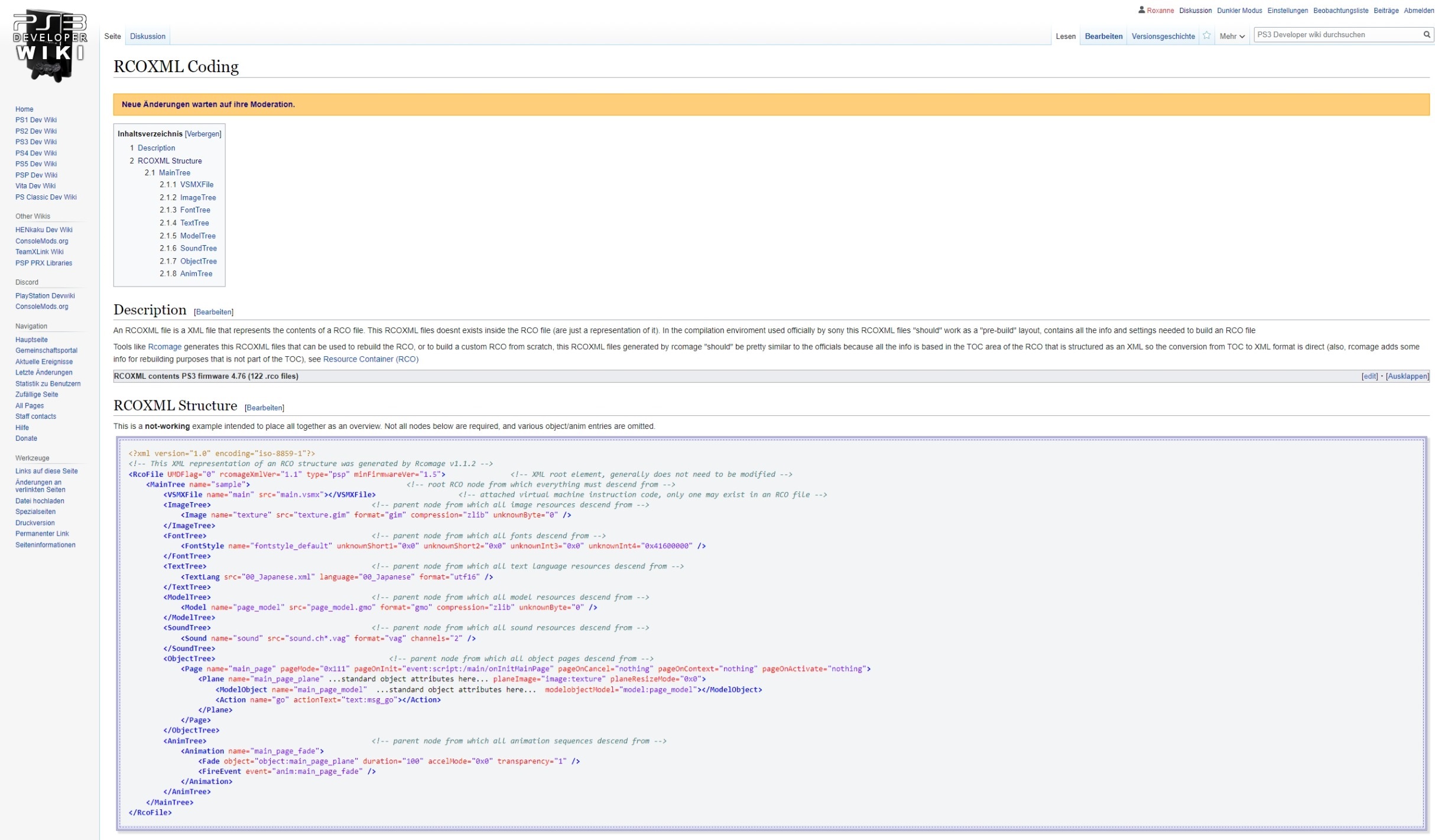
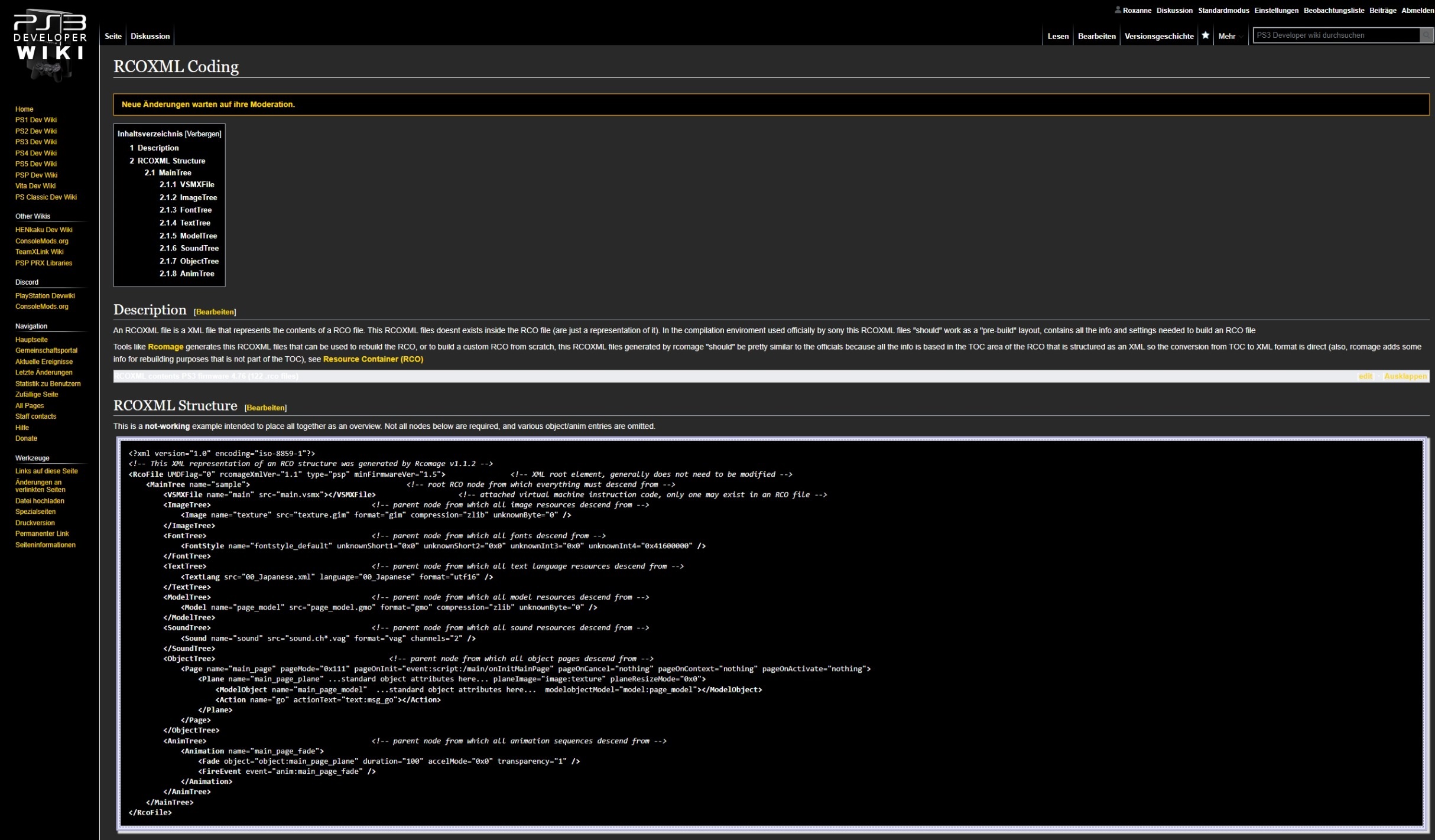
Hover over each Image to see what I mean. (neat trick! ~Derf)
Example 1[edit | edit source]
- I know we can't fix the white background without uploading a new transparent file, yet we need to discuss this for future uploads.
- Most of the Blue text (existing pages) turns into yellow but not all (see the Username from the Uploader of this image file or every link on the top right corner).
- Fixed - Valid links all now match. White color on top-right menu and usernames was chosen to stand out more on history pages. Derf (talk) 07:02, 11 June 2023 (CEST)
- What about those links for "Read", "Edit", "View History" on the top right corner? It was kept in white for purpose or shouldn't we turn them into gold as well?
- Fixed - Valid links all now match. White color on top-right menu and usernames was chosen to stand out more on history pages. Derf (talk) 07:02, 11 June 2023 (CEST)
- Same for Red text (non-existing pages) (see my User name on the right top corner or the "Discussion" link on the top left corner).
- Fixed - Redlinks are now all red. Derf (talk) 07:02, 11 June 2023 (CEST)
- The "Discussion" link on the top left corner is still white assuming that there is a Discussion page available, but which isn't ! Also when on a Discussion page, getting back to the "Main" article displays still in white color instead of turning yellow as well.
- Also when editing a Talk Page for uploaded Files, the "File" button on the top left corner have a grey background. This was fixed for normal pages but probably forgot to change that for File pages as well.
- Editing pages in general also needs some small fixes. The buttons for "Saving your changes" (white font within blue background) and the "Abort" button (red font) is losing the color. In my opinion we could keep them the same as they are on the light standard mode.
- Fixed - Redlinks are now all red. Derf (talk) 07:02, 11 June 2023 (CEST)
- The * on the overview which pages are using this images keeps black.
- The "More" Options on the right top corner still has a black downwards arrow together that the search box is now hard to read.
- Fixed. Derf (talk) 07:02, 11 June 2023 (CEST)
- Maybe I would turn the text inside the Search box in white ("Search PS3 Developer wiki") and the "Read", "Edit", and "View History", into yellow as mentioned before. This should fix the readibility clearly. Also maybe we can find something for the magnifier symbol inside the search box.
- Fixed. Derf (talk) 07:02, 11 June 2023 (CEST)
Example 2[edit | edit source]
- Every blue text inside the TOC turns into white and not into yellow anymore. We need to discuss a main color using for all blue text and not multiple ones.
- Fixed - I prefer white since they are all links, but I have set them all to gold. Derf (talk) 07:15, 11 June 2023 (CEST)
- I prefer yellow since as you say that they are clickable. We should kept one color since the light theme is also using only blue for existing links/pages and red for non-existent ones.
- The "Hide" button inside the TOC needs to be changed to yellow as well.
- Fixed - I prefer white since they are all links, but I have set them all to gold. Derf (talk) 07:15, 11 June 2023 (CEST)
- Here is seems that Red Links are working now inside the table. Why not on other parts like explained in the first example above?
- This is also a good example that the font seems to be bigger now.
Example 3[edit | edit source]
- Black text behind grey background turns unreadable because of changing both the color of the text into white together with the background into a slighter grey
- Now the * is turning into white. Why not in the first Example?
- XML code is now everything in white !!!
- Fixed. Derf (talk) 07:43, 11 June 2023 (CEST)
- This is a good example for the thing as mentioned on Discord earlier. Now it's working but we have blue font on a black background. It is still hard to read so I would make as mentioned the article page itself black and such things like <pre> text, tables, templates etc. into grey or another color of choice so it should be readable again.
- I tried it with different gray colors; it's most readable in black. You can play with this by adding
.client-dark-mode pre { background-color: #333!important; }to User:Roxanne/vector.css (this will also apply to any other "pre" field too). Derf (talk) 19:07, 11 June 2023 (CEST)- Sorry but there should be a way to find a good grey color. Especially since the standard light theme is also using a grey background. Every <pre> text, every XML code and every Template has another color than white in the standard theme.
- Yeah, but those greys are nearly white and aren't exactly a "dark mode" color. You can play around the colors and see if you can find a good combo that would fit a dark mode. I will mess with it more when I get a chance. Derf (talk) 07:21, 12 June 2023 (CEST)
- If nothing works, my suggestion would be just to use the same light grey color like on the standard mode. Everything looks better than having blue font on a black background, sorry. Roxanne (User talk:Roxanne|talk]]) 12th June 2023 18:33 GMT+1
- In the meantime... #1c1c1c looks better than #000, but the best readability is achieved only with grey tones equal or higher than #ccc --Sandungas (talk) 02:16, 14 June 2023 (CEST)
- How about #303841? That's the default color SublimeText uses for its background. Honestly, black is most readable to my eyes; but maybe that's just because I've stared at code in dark mode at 2am for too long :) Derf (talk) 04:42, 17 June 2023 (CEST)
- Im reading my previous comment and im not sure sure if i was clear, to summarize, the problem we have right now is the <pre>, <code>, <syntaxhighlight> (deprecated) and some more tags are inheriting the colors from the syntaxhighlights settings, you already know this because we was talking about it in User_talk:Derf. The syntaxhighlights settings contains 75 colors (repeated many times) that was supposed to work fine with a bright background and we changed 3 of them to improve readability over bright backgrounds a bit more. Well... the only way to have a nice color selection for dark backgrounds is to replace most/all the syntaxhighlight colors, is not just the background, is needed to replace a lot more colors (remember i leave a link with a dark color setup in your tak page). The alternative (or better said... the easy way) is to dont change any color in the dark skin. #303841 probably is too bright, the comments in most languages have a middle grey color close to that --Sandungas (talk) 12:32, 17 June 2023 (CEST)
- Is it just me or why we can't just keep the same color like on standard mode, which is #F3F4F5. It would fix all problems. Roxanne (talk) - 17th June 2023 - 13:58 GMT+1
- Well, this is one of the cases where i prefer to "do it well" or dont do it at all, and i think is a bad timing to enter in this forest specially because the syntaxhighligh color settings for vector skin was not fully reviewed (we just changed 3 colors but it can be made way better). Im reviewing the talk in derf user page and the way to do it right is by adding a lot of
.client-dark-mode .mw-highlight .s {color:WHATEVER}
(in this example the .s changes the color for "strings" data types inside the highlighted code), i mentioned above that are up to 75 colors, but in derf tak page i counted only 11 colors because a lot of them are repeated (in the same way we can group them to change them in groups for the dark skin), anyway for reference of how many colors we need to modify take a look at this [1] (it seems to be a "port" of monokai skin for linux terminal and looks really nice). Thats the better way to do it by replacing pretty much all the syntaxhighlight colors --Sandungas (talk) 14:15, 17 June 2023 (CEST)
- Well, this is one of the cases where i prefer to "do it well" or dont do it at all, and i think is a bad timing to enter in this forest specially because the syntaxhighligh color settings for vector skin was not fully reviewed (we just changed 3 colors but it can be made way better). Im reviewing the talk in derf user page and the way to do it right is by adding a lot of
- Is it just me or why we can't just keep the same color like on standard mode, which is #F3F4F5. It would fix all problems. Roxanne (talk) - 17th June 2023 - 13:58 GMT+1
- Im reading my previous comment and im not sure sure if i was clear, to summarize, the problem we have right now is the <pre>, <code>, <syntaxhighlight> (deprecated) and some more tags are inheriting the colors from the syntaxhighlights settings, you already know this because we was talking about it in User_talk:Derf. The syntaxhighlights settings contains 75 colors (repeated many times) that was supposed to work fine with a bright background and we changed 3 of them to improve readability over bright backgrounds a bit more. Well... the only way to have a nice color selection for dark backgrounds is to replace most/all the syntaxhighlight colors, is not just the background, is needed to replace a lot more colors (remember i leave a link with a dark color setup in your tak page). The alternative (or better said... the easy way) is to dont change any color in the dark skin. #303841 probably is too bright, the comments in most languages have a middle grey color close to that --Sandungas (talk) 12:32, 17 June 2023 (CEST)
- How about #303841? That's the default color SublimeText uses for its background. Honestly, black is most readable to my eyes; but maybe that's just because I've stared at code in dark mode at 2am for too long :) Derf (talk) 04:42, 17 June 2023 (CEST)
- In the meantime... #1c1c1c looks better than #000, but the best readability is achieved only with grey tones equal or higher than #ccc --Sandungas (talk) 02:16, 14 June 2023 (CEST)
- If nothing works, my suggestion would be just to use the same light grey color like on the standard mode. Everything looks better than having blue font on a black background, sorry. Roxanne (User talk:Roxanne|talk]]) 12th June 2023 18:33 GMT+1
- Yeah, but those greys are nearly white and aren't exactly a "dark mode" color. You can play around the colors and see if you can find a good combo that would fit a dark mode. I will mess with it more when I get a chance. Derf (talk) 07:21, 12 June 2023 (CEST)
- Sorry but there should be a way to find a good grey color. Especially since the standard light theme is also using a grey background. Every <pre> text, every XML code and every Template has another color than white in the standard theme.
- I tried it with different gray colors; it's most readable in black. You can play with this by adding
- This is a good example for the thing as mentioned on Discord earlier. Now it's working but we have blue font on a black background. It is still hard to read so I would make as mentioned the article page itself black and such things like <pre> text, tables, templates etc. into grey or another color of choice so it should be readable again.
- Fixed. Derf (talk) 07:43, 11 June 2023 (CEST)
Example 4[edit | edit source]
- Moderation toolbox is hardly visible.
- Where do you mean? Derf (talk) 08:18, 11 June 2023 (CEST)
- The yellow one on top when there is Moderation needed.
I would keep it in yellow so Mods won't ignore it.Wait we need to find another bright color since the blue text will be already turned into yellow. Or maybe we can make a exception that CSS won't change the Moderation toolbox.
- The yellow one on top when there is Moderation needed.
- Where do you mean? Derf (talk) 08:18, 11 June 2023 (CEST)
- Again black text behind grey background is hard to read like on the 3rd example.
- The 4th Example is a great example what we will do with transparent images, which have a black font tho, like the "PS2" and "PS3" logos on that wiki since black text on a black background is never a good idea.
- This still needs fixing but could be made manually by User:Sandungas by choosing another color for the table if there is no other solution available.
- I think we can make it a "PS3 Logo" template and I can invert the color when in dark mode. I'll try this out soon. Derf (talk) 19:18, 11 June 2023 (CEST)
- Added Template:InvertibleImage to do it.
- I think we can make it a "PS3 Logo" template and I can invert the color when in dark mode. I'll try this out soon. Derf (talk) 19:18, 11 June 2023 (CEST)
- The same applies for the black arrows for tables including a sorting function. They keep black on Dark Mode.
- This still needs fixing but could be made manually by User:Sandungas by choosing another color for the table if there is no other solution available.
- It seems that Dark Mode is creating additional borders within some tables. As an author of the PS4 version from the PS2 Classics Emulator Compatibility List, I highly doubt that this was intended!
- Fixed. Derf (talk) 08:18, 11 June 2023 (CEST)
There is one small border still left on the left side of the "Legend" template. Hmm seems I get different results on different screen resolutions. This "hidden" tag might be problematic, needs more testing.Fixed by not handling the text below the Legend not as a tablecell anymore, so it also fits with the background from the article itself and not with the table by creating a unnecessary black background.
- Fixed. Derf (talk) 08:18, 11 June 2023 (CEST)
- Custom tablecell templates made by User:Sandungas seems to work only outside of a table. This makes the whole page kinda obsolete now !!!
- The indicator for each letter displaying on which table you are right now turns from red into white. While the indicator is still working with white, it was intended to keep it in red because it works like that on light mode normally.
- Not sure what you mean. Can you post a screenshot? Derf (talk) 07:18, 12 June 2023 (CEST)
- Please check the A, B, C, D, E letters and so on on the hover example 4 image right above when the first PS2 Title is listed. User:Roxanne (talk) - 12th June 2023 - 18:52 GMT+1
- Not sure what you mean. Can you post a screenshot? Derf (talk) 07:18, 12 June 2023 (CEST)
wikitable[edit | edit source]
border-color[edit | edit source]
Derf i think i found how to fix something that looks very weird to me, not sure if it was made on purpose but the fully white wikitable borders (#fff) have too much contrast and are too much disturbing, the problem is located in MediaWiki:Common.css, in the line segment:
.client-dark-mode .wikitable > * > tr > td{border-color:#fff}
That line is overriding the default:
.wikitable > * > tr > td{border:1px solid #a2a9b1; padding:0.2em 0.4em}
Im checking this with a code inspector and the default #a2a9b1 that was looking fine with vector skin looks fine too in the dark skin, so my suggestion is to delete the line segment i mentioned (this way wiki fallbacks to default and the wikitable border-color will be #a2a9b1 common for vector and dark skins), the other alternative is to keep the line segment but modify the #fff by other grey tone... but as said the #a2a9b1 looks pretty good and i think is better to stick to defaults when possible --Sandungas (talk) 21:49, 12 June 2023 (CEST)
background-color[edit | edit source]
The vertical border that appeared at botom left of Template:PS2_Classics_Emulator_Compatibility_List_Legend is a problem of the dark skin, the template was fine, see the same problem in this minimalistic samples, it seems the default border auto collapse is partially broken User:Sandungas
| row 1 |
| 1/2 | ||
| 2/1 | 2/2 | 2/3 |
| 3/2 |
| cell 1/1 | cell 1/2 | cell 1/3 |
| cell 2/1 | cell 2/2 |
- Feel free to revert my edits on the PS2 Legend Template. It was just an idea to fix it quickly for the current Dark Mode setup without changing your design but I would also welcome to fix the Dark Mode itself and not to change various Templates / Pages. --- User:Roxanne (11th June 2023 - 23:38 CET + 1)
- The idea was to keep all the legend contents inside the same wikitable for convenience, to prevent problems caused by dinamic width changes caused by small screens resolutions, to have better control of the surrounding margins with other templates, etc... I was starting the last row of the table with "!" (table header style) because i wanted that texts in bold and centered... but as a payback it was also inheriting the blue color of header cells, thats why i also added a background:#ffffff to override the blue header color. I have to admit it was a dirty/lazy way to do it but after thinking in it i figured the best solution (to achieve the same) is what i did in this edit. The line starts as "|" (standard row) and aligning the text to center and setting bold font manually. Is only a detail that i like how it looks but i dont have much preferences of how to do it, what you did replacing the table row with a <span> is fine but i would like to see the next changes to the dark skin settings before deciding, specially how the background color of wikitables changes if we fill the table cell with transparent colors. In theory fully transparent colors (either "background:rgba(0,0,0,0)" or "background:transparent") and colors with intermediate alpha levels (either "background:rgba(0,0,0,0.2)" or "background:hsla(0,0%,0%,0.2)") could be used to solve a lot of the problems caused by the dark skin because are going to be "merged" with the skin color behind them User:Sandungas
- If you ask me then I prefer my edit on the PS2 Legend because the mw-datatable is still intact on both the light mode as well on Dark Mode when using your code you used before and using now on the PS1 Legend. But it's just my personal taste. As said before feel free to revert it. Roxanne (talk) 12th June 2023 - 19:04 GMT+1
- In this edit i didnt realized about the highlighting problem, and i dont remember well but maybe that was another reason why i was starting the last table row with "!" (header style) because being a header it was preventing the row highlighting. For curiosity sake, check how it looks this edit in the dark skin, i just filled the last table row with transparent for a test, this trick (and the fixed border collapse) should allow to keep that texts inside the table, but the attribute "background:transparent" is not displayed as transparent (it should be fully black like the page "wallpaper" but is an intermediate grey), not sure why --Sandungas (talk) 21:00, 12 June 2023 (CEST)
- If you ask me then I prefer my edit on the PS2 Legend because the mw-datatable is still intact on both the light mode as well on Dark Mode when using your code you used before and using now on the PS1 Legend. But it's just my personal taste. As said before feel free to revert it. Roxanne (talk) 12th June 2023 - 19:04 GMT+1
- The idea was to keep all the legend contents inside the same wikitable for convenience, to prevent problems caused by dinamic width changes caused by small screens resolutions, to have better control of the surrounding margins with other templates, etc... I was starting the last row of the table with "!" (table header style) because i wanted that texts in bold and centered... but as a payback it was also inheriting the blue color of header cells, thats why i also added a background:#ffffff to override the blue header color. I have to admit it was a dirty/lazy way to do it but after thinking in it i figured the best solution (to achieve the same) is what i did in this edit. The line starts as "|" (standard row) and aligning the text to center and setting bold font manually. Is only a detail that i like how it looks but i dont have much preferences of how to do it, what you did replacing the table row with a <span> is fine but i would like to see the next changes to the dark skin settings before deciding, specially how the background color of wikitables changes if we fill the table cell with transparent colors. In theory fully transparent colors (either "background:rgba(0,0,0,0)" or "background:transparent") and colors with intermediate alpha levels (either "background:rgba(0,0,0,0.2)" or "background:hsla(0,0%,0%,0.2)") could be used to solve a lot of the problems caused by the dark skin because are going to be "merged" with the skin color behind them User:Sandungas
It seems the problem is caused by the default:
.wikitable{
    background-color: #f8f9fa; /* this is the phantom border... but is not a border, it smells like a bug of vector skin */
    color: #202122; /* this is a black font.... completly unreadable over a black background */
    margin: 1em 0;
    border: 1px solid #a2a9b1;
    border-collapse: collapse;
}
I dont know where is located this default settings (i can see it in a code inspector but i cant find it in MediaWiki:Common.css) anyway, its location doesnt matters because we dont need to modify it (seems to be common for all skins)
The other "etc" attributes i mentioned (margin, border, and border-collapse) are overrided by the dark skin settings, in other words... the dark skin is modifying them (as expected), but the dark skin settings are not overriding the #f8f9fa and the #202122
The #f8f9fa is very close to white, thats what can be seen at the wikitable "phantom borders" roxanne and me was discussing and can be seen in the small wikitable samples above. The #202122 is the wikitable font color, very close to black
So i guess the solution is to override both in the dark skin settings --Sandungas (talk) 23:49, 12 June 2023 (CEST)
Just tested to swap them, font "color:#f8f9fa" looks fine (darkest colors would look fine too, but not brighter please), but the background-color should match with this setting (in the current dark skin):
.client-dark-mode .mw-datatable td{background:black}
--Sandungas (talk) 00:09, 13 June 2023 (CEST)
.client-dark-mode .wikitable{background-color:black!important}
And this should fix both problems by replacing the black font by white (or whatever other color you used for fonts)
.client-dark-mode .wikitable{background-color:black!important; color:white;}
Header sorting arrows images[edit | edit source]
The sorting arrows that appears in the headers of "class=sortable" wikitables should be able to invert its colors, either with the "class=invertible-image" or something else
.jquery-tablesorter th.headerSort{background-image:url(/ps3/resources/src/jquery.tablesorter.styles/images/sort_both.svg?6b5ca)}
.jquery-tablesorter th.headerSortUp{background-image:url(/ps3/resources/src/jquery.tablesorter.styles/images/sort_up.svg?dd026)}
.jquery-tablesorter th.headerSortDown{background-image:url(/ps3/resources/src/jquery.tablesorter.styles/images/sort_down.svg?fb375)}
- I was able to figure those selectors out, but the issue is doing
filter:invert(1)on it inverts the colors of the whole cell, not just the image. It's odd they make it part of thethinstead of a <img> tag like everything else. I'll try and see if I can hide the image and add it back in a :after tag and invert that. Otherwise, I guess the only way is to upload an inverted .svg and override. Derf (talk) 04:50, 17 June 2023 (CEST)- Tried doing ::before, but to get it to actually show the image you have to use a different display type for the element (like display:inline-block) which shoves everything in that cell together and is generally a pain to work with. I ended up just uploading inverted SVGs and replaced em - fixed! Derf (talk) 05:27, 17 June 2023 (CEST)
Link Colors[edit | edit source]
The gold color that all links currently are is arbitrary. It looked good on the ConsoleMods theme, but it definitely can be different here.
The best looking of each color seems to be:
- cornflowerblue
- red
- blueviolet
- deeppink
- deepskyblue
- fuchsia
- gold (current color)
- lawngreen
You can set this in your user CSS (e.g. User:Roxanne/vector.css) to see it live by adding:
.client-dark-mode a, .client-dark-mode .mw-userlink bdi, .client-dark-mode #toc a *, .client-dark-mode .toctitle .toctogglelabel {
   color: blueviolet!important;
}
- cornflowerblue looks nice, im fully into keeping the links in a blue tone, either cornflowerblue or something close to it (yellows and oranges fits better for page section titles and things that are not clickables.. and red for errors and broken links) --Sandungas (talk) 13:50, 17 June 2023 (CEST)
PARAM.SFO[edit | edit source]
Just when I started to like the Dark Mode, I found another example where instead of bringing new features, we should fix the existing code first !!! The PARAM.SFO page is a horrible example what can go wrong on Dark Mode. In fact I don't even know where to start. What I can tell you tho regarding the "best color background" used for every <pre> and XML code is that the newest suggestion from User:Sandungas is again flawed because of two reasons. Luckily the PARAM.SFO page is a good example.
- The example shown above still shows no blue text and how it's handled within that background.
- Code on this wiki posted written in "C" language contains "{" and "}" symbols shown as standard black color on the light mode. So either we make them white or as I suggested, just use the same background color like on light mode and every problem is solved.
User:Roxanne - 18th June 2023 - 12:21 GMT+1
- Flawed "again" ?, by saying that you are insinuating two (or more) of the things i said related with syntaxhighlight was flawed but you are not telling what you consider flawed of the things i said, and i dont think i said anything flawed about it. Honestly im wondering if you understood what i said about the molokai skin. Btw derf dont get misleading into thinking the problems in PARAM.SFO page are something isolated, there are tenths of pages affected by that kind of problems... or better said hundreds because some pages have many tables... or better said thousands because some of that problems affects table cells individually, so please before starting messing around with PARAM.SFO page take some time to consider whats the scope of the problems and think in the most practical way to solve them by minimizing the need to do thousands of edits in hundreds of pages User:Sandungas
- Just changed it back to the light mode color to avoid the whole issue. Also updated a lot of templates and searched for pages setting white backgrounds to fix issues. Still WIP. Derf (talk) 06:11, 1 July 2023 (CEST)
- Problem solved in my eyes. Many thanks for your hard work. User:Roxanne - 01st July 2023 - 08:19 GMT+1
- Just changed it back to the light mode color to avoid the whole issue. Also updated a lot of templates and searched for pages setting white backgrounds to fix issues. Still WIP. Derf (talk) 06:11, 1 July 2023 (CEST)
