Dark Mode Suggestions: Difference between revisions
Jump to navigation
Jump to search
mNo edit summary |
mNo edit summary |
||
| Line 13: | Line 13: | ||
=== Example 1 === | === Example 1 === | ||
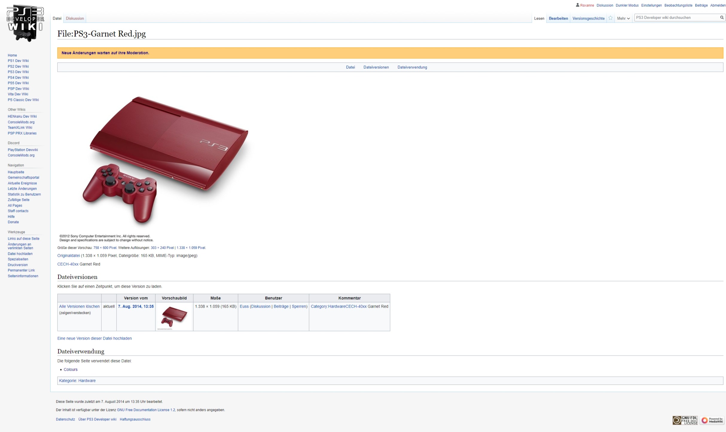
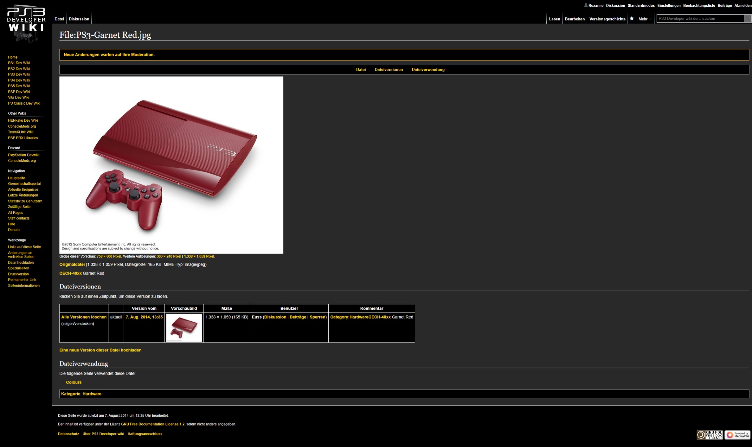
{{hidden|Click on "show" on the right corner|{{HoverImage|PS3-Garnet Red light.jpeg|PS3-Garnet Red dark.jpeg}}}} | {{hidden|Click on "show" on the right corner|{{HoverImage|PS3-Garnet Red light.jpeg|PS3-Garnet Red dark.jpeg}}}} | ||
* I know we can't fix the white background without uploading a new transparent file, yet we need to discuss this for future uploads. | |||
* Most of the Blue text (existing pages) turns into yellow but not all (see the Username from the Uploader of this image file or every link on the top right corner). | |||
* Same for Red text (non-existing pages) (see my User name on the right top corner or the "Discussion" link on the top left corner). | |||
* The <nowiki>*</nowiki> on the overview which pages are using this images keeps black. | |||
* The "More" Options on the right top corner still has a black downwards arrow together that the search box is now hard to read. | |||
=== Example 2 === | === Example 2 === | ||
Revision as of 19:07, 10 June 2023
Puh ... where I start this?
Not only that this shouldn't be at all live in the current setup, the announcement on both Twitter and Discord was like we released a finished product. Instead as already explained on Discord that "we have now open Pandora's Box" in terms of editing either the CSS code or half of the wiki itself (or both). Before releasing a feature like this and bringing it live, we should make some specific rules (!) we need to discuss. But it seems that people got already excited with turning everything from White into Black without thinking about the consequences of the readability of the wikis itself.
- We need to discuss what we will do with images uploaded as .jpg files having a white background.
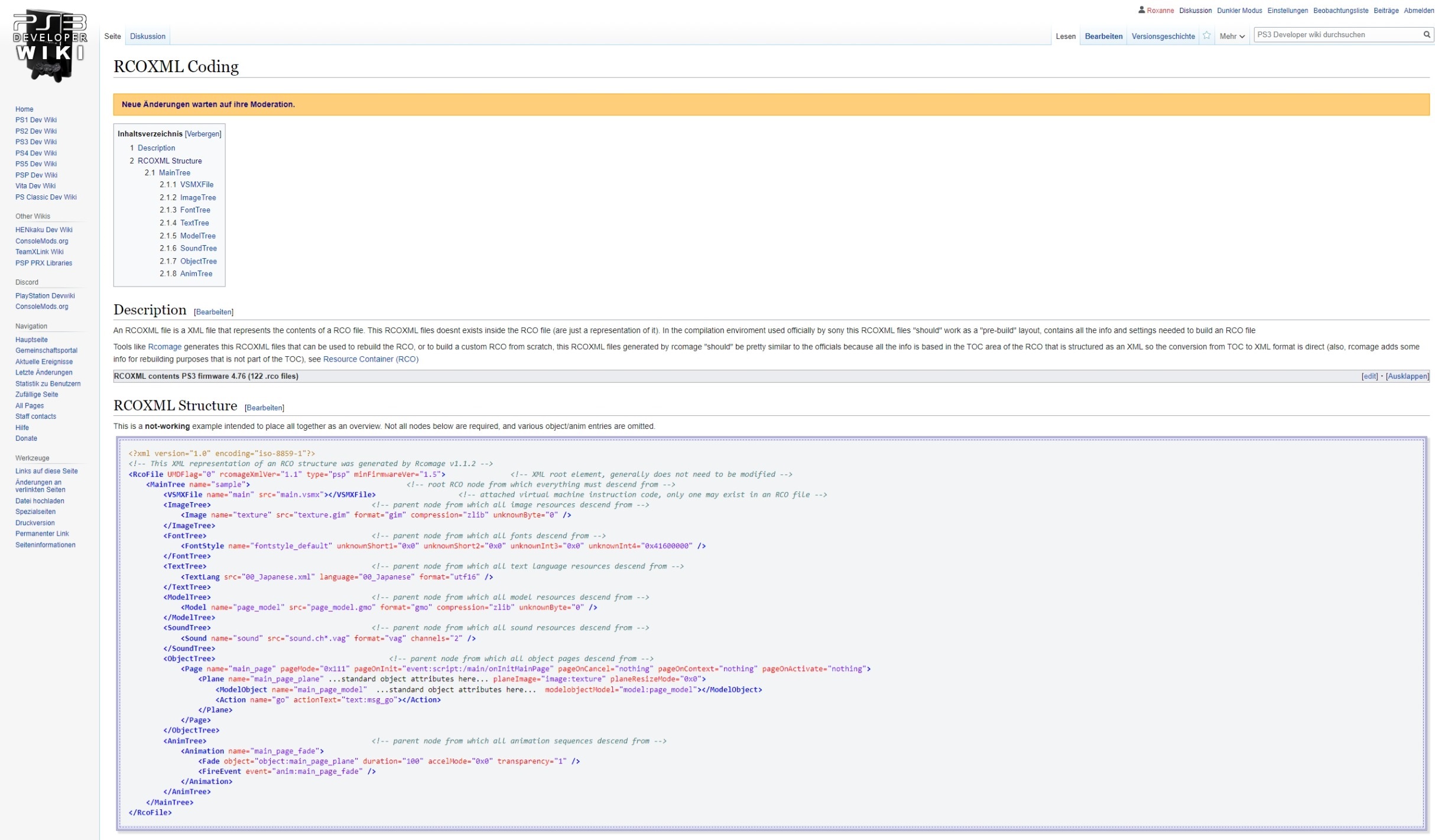
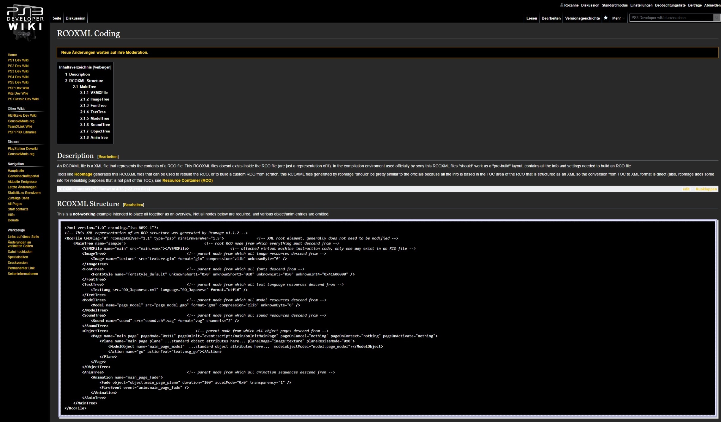
- We need to discuss which colors needs to replaced in Dark Mode because there are now red links for non-available pages displaying just white together with many more bad examples.
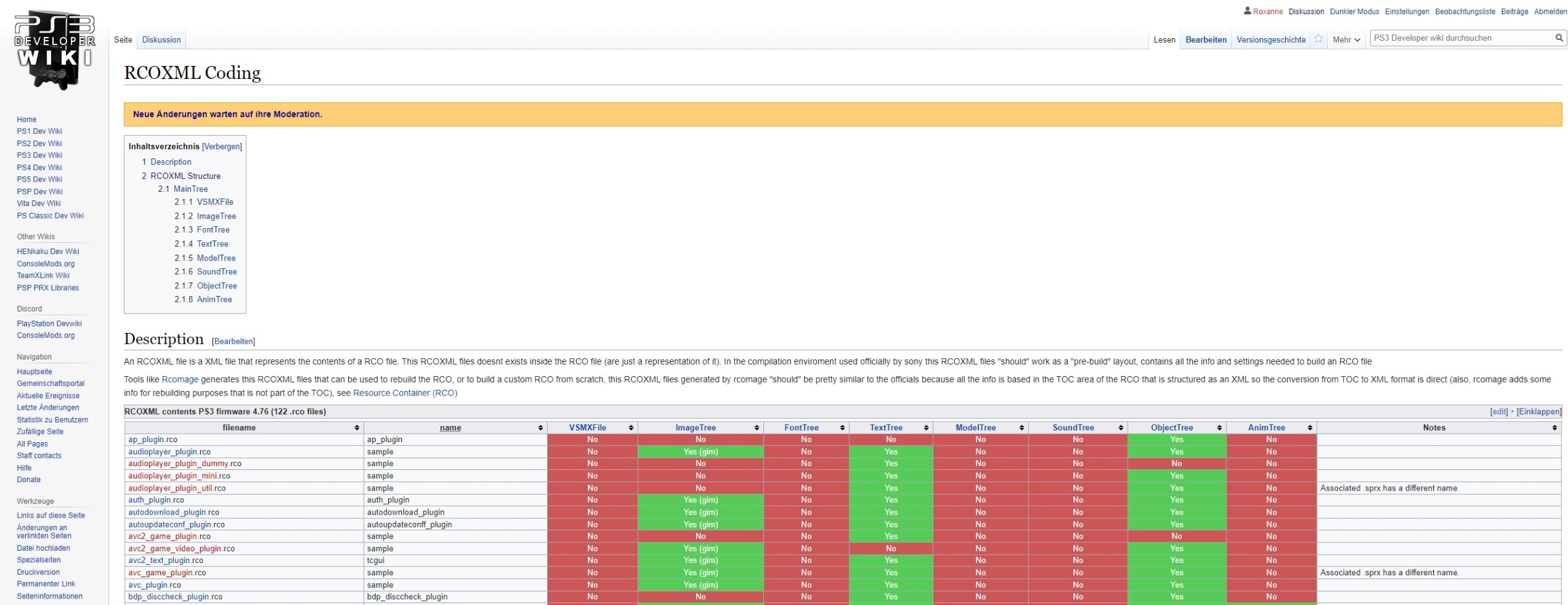
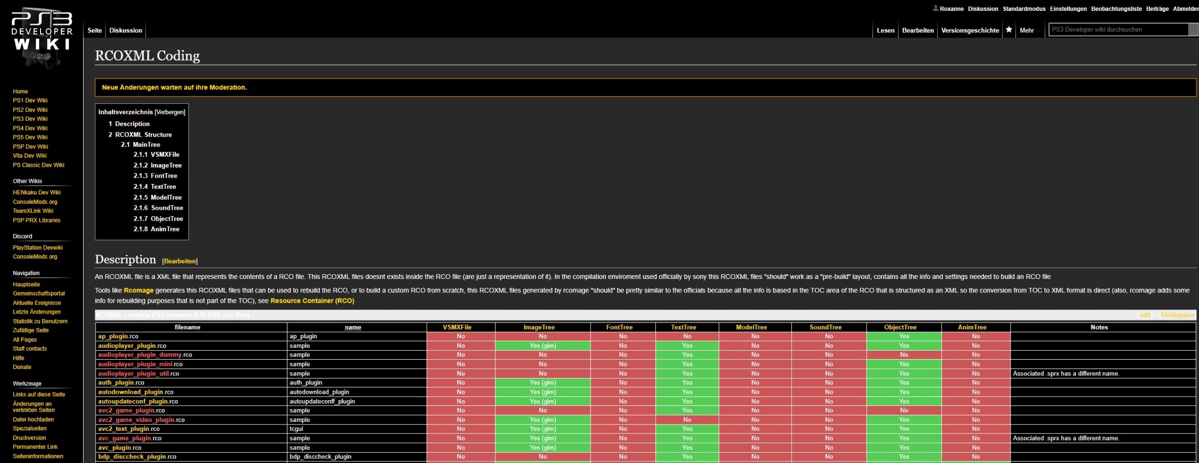
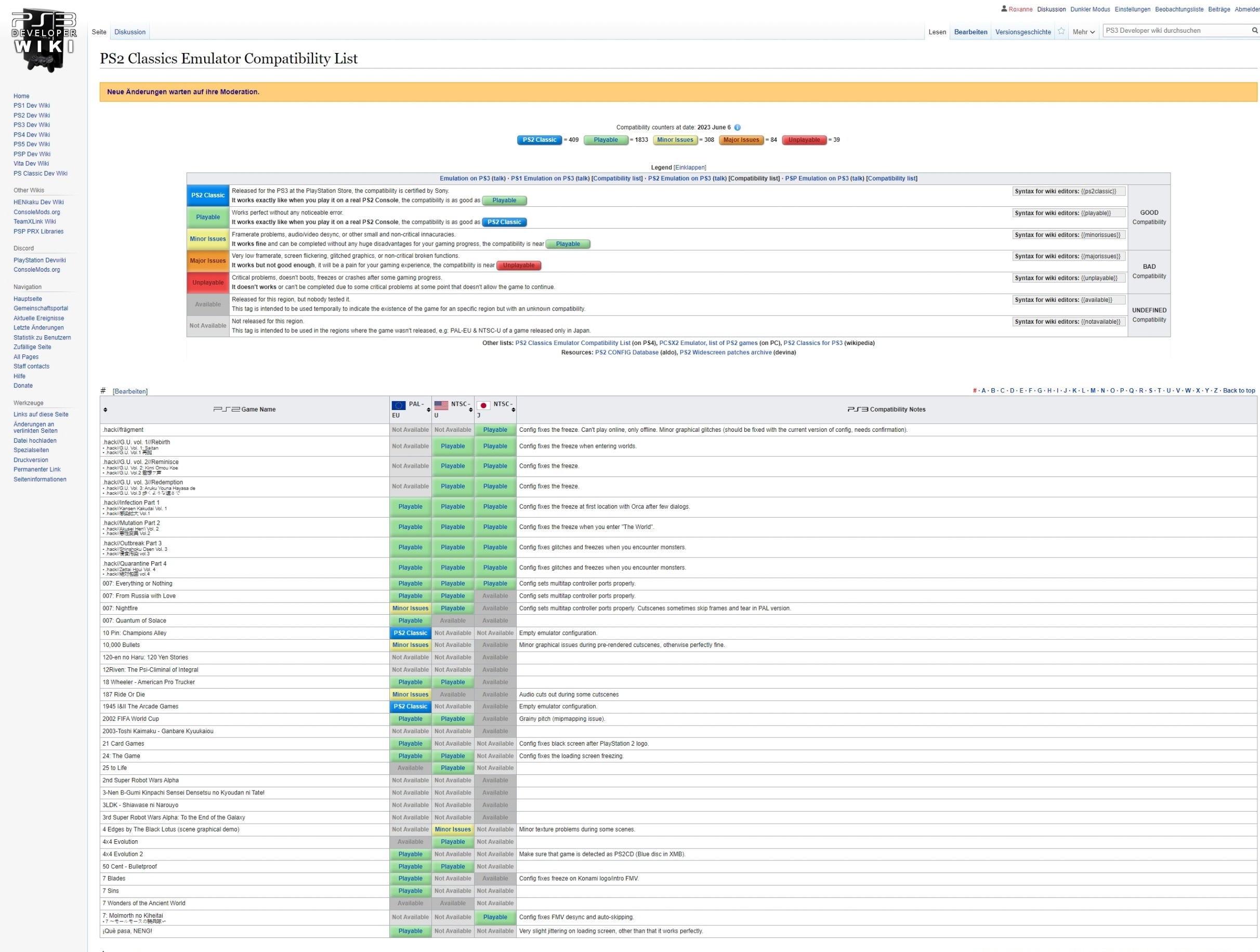
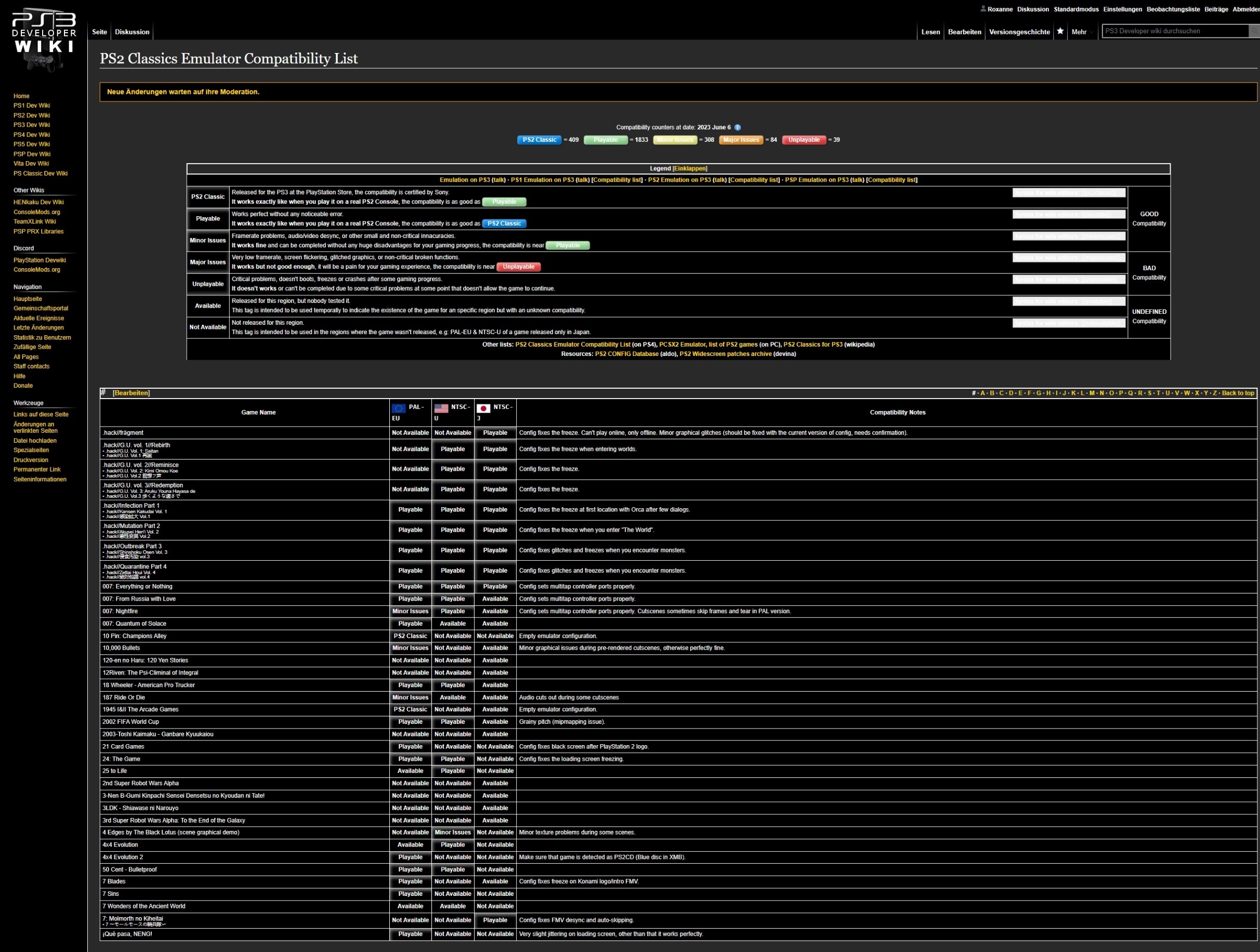
- Same as with the problematic about the red links, every page containing XML code or Templates are now broken in Dark Mode because of displaying every text in white in front of a black background (it seems templates are working as long there aren't in any tablecells).
- Also I have the feeling that the font is now bigger in Dark Mode together that spaces are needing more space (a good example are when looking at the Main Page where every Template is now needing more space than in light mode.
Hover over each Image to see what I mean.
Example 1
- I know we can't fix the white background without uploading a new transparent file, yet we need to discuss this for future uploads.
- Most of the Blue text (existing pages) turns into yellow but not all (see the Username from the Uploader of this image file or every link on the top right corner).
- Same for Red text (non-existing pages) (see my User name on the right top corner or the "Discussion" link on the top left corner).
- The * on the overview which pages are using this images keeps black.
- The "More" Options on the right top corner still has a black downwards arrow together that the search box is now hard to read.
Example 2
Example 3
